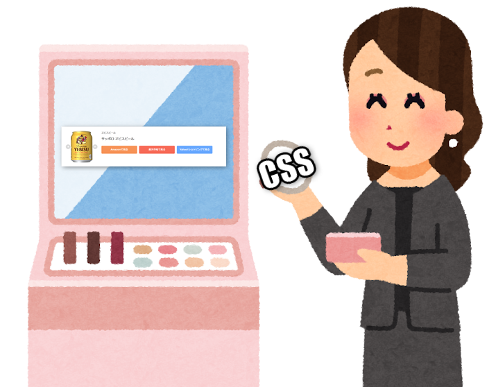
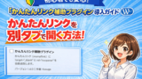
もしもアフィリエイトの「かんたんリンク」の見た目を、CSSを使って自分好みに変えてみましょう。
この記事は、以下の記事の続きです。
最初に:CSSコードの適用方法
CSSコードをブログ記事に適用する方法はいくつかあります。お好みの方法を選んでみましょう。
手軽に試すなら、ブロックエディターのカスタムHTMLブロックを使うのがおすすめです。
記事本文のHTMLに直接組み込むため、CSSの効果をすぐに確認できますよ。
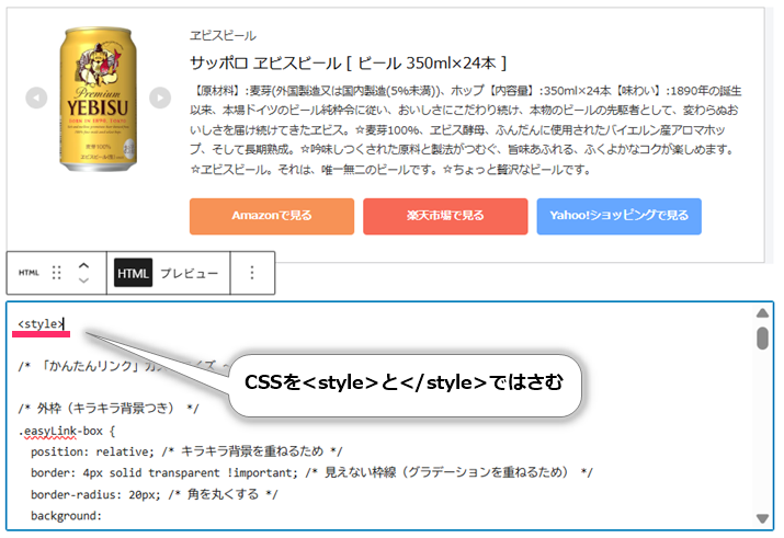
① カスタムHTMLブロックを使う(おすすめ)
<style>~</style>タグでCSSコードを囲み、カスタムHTMLブロックとして記事中に直接挿入します。
これは、その記事内でのみCSSの効果を確実に、かつ一時的に試したい場合に便利な方法です。
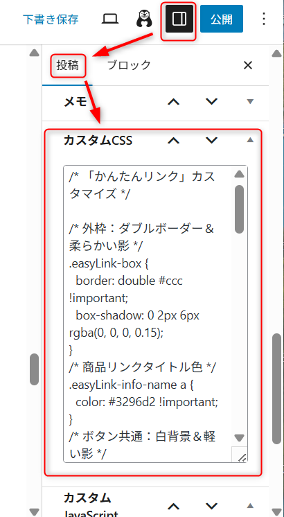
② テーマのカスタムCSSを使う
WordPressテーマによっては、専用のカスタムCSS入力欄が用意されています。
次は、テーマCocoonのブロックエディター内、「投稿」設定画面にある「カスタムCSS」欄にCSSコードを貼り付ける方法です。この方法で追加したCSSは、その記事全体に影響を与えます。
③ 追加CSSを使う(サイト全体に適用)
WordPressの管理画面から「外観」→「カスタマイズ」→「追加CSS」に進み、CSSコードを貼り付けます。
この方法で追加されたCSSは、サイト全体のすべての「かんたんリンク」に反映されます。
複数の記事で同じスタイルを使いたい場合に便利です。
お好みのスタイルを見つけよう!
ここから、かんたんリンクのカスタマイズ用CSSサンプルをいくつかご紹介します。
気に入ったスタイルがあれば、ぜひ試してみてくださいね。
◆ ピンクのガーリーデザイン
/* 「かんたんリンク」カスタマイズ ~ ピンクのガーリーデザイン */

/* 全体を囲む枠のスタイル */
.easyLink-box {
  border: 3px dashed #f9b5d1 !important; /* ピンクの点線枠 */
  border-radius: 20px; /* 角を丸くする */
  background:
    linear-gradient(145deg, #ffe6f0 0%, #fff0f8 100%); /* ピンクのグラデーション背景 */
  box-shadow:
    0 0 0 4px #fff6fb inset, /* 内側に白っぽい影 */
    0 6px 16px rgba(255, 182, 193, 0.4); /* 柔らかいピンクの外側の影 */
  padding: 20px; /* 内側の余白 */
  font-family: 'Zen Maru Gothic', 'Hiragino Maru Gothic ProN', 'Kosugi Maru', 'Yu Gothic', sans-serif; /* ガーリーなフォント */
  color: #5c3a4d; /* 濃いめのピンク文字 */
}

/* 商品タイトルのリンク */
.easyLink-info-name a {
  color: #e75480 !important; /* 鮮やかなピンク */
  font-weight: bold; /* 太字 */
  font-size: 18px; /* 文字サイズ */
  text-decoration: none; /* 下線をなくす */
  display: inline-block; /* リンクをブロックとして扱う */
  padding-bottom: 4px; /* 下線との間の余白 */
  border-bottom: 2px dotted #f8a8c5; /* 明るいピンクの点線下線 */
  text-shadow: 1px 1px 0 #fff0f5; /* ふんわりした影 */
}

/* 各ボタンの共通スタイル */
a[class*="easyLink-info-btn-"] {
  display: inline-block; /* ボタンを横並びにする */
  padding: 10px 18px; /* ボタンの内側の余白 */
  margin: 8px 6px 0 0; /* ボタン間の余白 */
  border-radius: 26px; /* 丸みのあるボタン */
  font-size: 14px; /* 文字サイズ */
  font-weight: bold; /* 太字 */
  text-decoration: none; /* 下線をなくす */
  border: none; /* 枠線をなくす */
  transition: all 0.3s ease; /* マウスオーバー時の変化を滑らかに */
  box-shadow: 0 3px 6px rgba(255, 182, 193, 0.3); /* ボタンのピンクの影 */
  position: relative; /* 必要に応じて位置調整に使用 */
  letter-spacing: 0.5px; /* 文字間隔を少し広げる */
}

/* Amazonボタンのスタイル(ピーチピンク) */
.easyLink-info-btn-amazon {
  background: linear-gradient(to bottom, #ffe5b4, #ffd8a8) !important; /* ピーチピンクのグラデーション */
  color: #a65c00 !important; /* ボタンの文字色 */
}

/* 楽天ボタンのスタイル(スイートローズ) */
.easyLink-info-btn-rakuten {
  background: linear-gradient(to bottom, #ffc1cc, #f8a8c5) !important; /* スイートローズのグラデーション */
  color: #a02c5a !important; /* ボタンの文字色 */
}

/* Yahoo!ショッピングボタンのスタイル(ストロベリーミント) */
.easyLink-info-btn-yahoo {
  background: linear-gradient(to bottom, #e0f7fa, #fce4ec) !important; /* ストロベリーミントのグラデーション */
  color: #00796b !important; /* ボタンの文字色 */
}

/* ボタンにカーソルを合わせた時 */
a:hover[class*="easyLink-info-btn-"] {
  transform: scale(1.08) rotate(-2deg); /* 拡大して少し回転させる */
  box-shadow: 0 6px 14px rgba(255, 192, 203, 0.6); /* より明るくふわっとした影 */
  opacity: 0.95; /* 少し透明にする */
  filter: brightness(105%); /* 少し明るくする */
}
◆ ノスタルジックなスタイル
/* 「かんたんリンク」カスタマイズ ~ ノスタルジックなスタイル */

/* 全体を囲む枠のスタイル */
.easyLink-box {
  background: #fdfaf4; /* クリーム色がかった白の背景 */
  border: 2px solid #d4b98f !important; /* 温かみのある茶色の枠線 */
  border-radius: 12px; /* 角を丸くする */
  box-shadow: 4px 6px 12px rgba(0,0,0,0.15); /* やわらかい影 */
  padding: 12px; /* 内側の余白 */
  font-family: "Hiragino Mincho ProN", "游明朝", serif; /* 落ち着いたフォント */
}

/* 商品タイトルのリンク */
.easyLink-info-name a {
  color: #5a6b4d !important; /* 緑がかった暗い色 */
  font-weight: bold; /* 太字 */
  text-decoration: none; /* 下線をなくす */
}

/* 各ボタンの共通スタイル */
a[class*="easyLink-info-btn-"] {
  display: inline-block; /* ボタンを横並びにする */
  padding: 6px 14px; /* ボタンの内側の余白 */
  margin-right: 6px; /* ボタン間の右側の余白 */
  border-radius: 8px; /* 角を丸くする */
  font-size: 14px; /* 文字サイズ */
  font-family: "Helvetica Neue", sans-serif; /* シンプルなフォント */
  transition: all 0.3s ease; /* マウスオーバー時の変化を滑らかに */
  box-shadow: 0 4px 6px rgba(0,0,0,0.1); /* やわらかい影 */
  color: #fff !important; /* 白い文字色 */
  text-decoration: none; /* 下線をなくす */
}

/* Amazon・楽天・Yahoo!ショッピングボタンの色 */
/* 落ち着いた色合いに調整 */
.easyLink-info-btn-amazon {
  background: #d8a84f !important; /* 落ち着いたオレンジ色 */
  border: 2px solid #d8a84f !important; /* 枠線の色も同じに */
}
.easyLink-info-btn-rakuten {
  background: #b3594e !important; /* 落ち着いた赤色 */
  border: 2px solid #b3594e !important; /* 枠線の色も同じに */
}
.easyLink-info-btn-yahoo {
  background: #7ca8c4 !important; /* 落ち着いた水色 */
  border: 2px solid #7ca8c4 !important; /* 枠線の色も同じに */
}

/* ボタンにマウスを合わせた時のスタイル */
a:hover.easyLink-info-btn-amazon {
  background: #fff !important; /* 背景を白に */
  color: #d8a84f !important; /* 文字色をオレンジに */
}
a:hover.easyLink-info-btn-rakuten {
  background: #fff !important; /* 背景を白に */
  color: #b3594e !important; /* 文字色を赤に */
}
a:hover.easyLink-info-btn-yahoo {
  background: #fff !important; /* 背景を白に */
  color: #7ca8c4 !important; /* 文字色を水色に */
}
◆ 白と黒のモノトーン
/* 「かんたんリンク」カスタマイズ ~ 白と黒のモノトーン */

/* 外枠のスタイル */
.easyLink-box {
  background: #111; /* 暗い背景色 */
  border: 4px solid #000 !important; /* 太くて真っ黒な枠線 */
  border-radius: 4px; /* 角を少しだけ丸める */
  box-shadow: 4px 4px 0 #333; /* 影で立体感を出す */
  padding: 12px; /* 内側の余白 */
  font-family: "Meiryo", "Osaka", sans-serif; /* フォント指定 */
  color: #575757; /* 暗めの文字色 */
}

/* 商品タイトルのリンク */
.easyLink-info-name a {
  color: #fff !important; /* 明るい白文字 */
  font-weight: bold; /* 太字 */
  font-size: 16px; /* 文字サイズ */
  text-shadow: 1px 1px 2px #000; /* 黒い影で文字を強調 */
}

/* 共通ボタンスタイル */
a[class*="easyLink-info-btn-"] {
  display: inline-block; /* ボタンを横並びにする */
  padding: 6px 14px; /* ボタンの内側の余白 */
  margin-right: 6px; /* ボタン間の右側の余白 */
  border: 2px solid #fff !important; /* 白い枠線 */
  border-radius: 2px; /* 角を少しだけ丸める */
  font-size: 14px; /* 文字サイズ */
  font-weight: bold; /* 太字 */
  color: #fff !important; /* 白い文字色 */
  /* 背景グラデーションをモノトーンに調整 */
  background: linear-gradient(to bottom, #444, #111) !important; /* 濃いグレーから黒へのグラデーション */
  box-shadow: 2px 2px 0 #000; /* 黒い影で立体感を出す */
  text-decoration: none; /* 下線をなくす */
  transition: all 0.3s ease; /* ホバー時の変化を滑らかに */
}

/* 各ボタンの色(Amazon、楽天、Yahoo!ショッピング) */
.easyLink-info-btn-amazon {
  background: linear-gradient(to bottom, #888, #555) !important; /* Amazonボタンを暗めのグレーグラデーションに */
  border-color: #555 !important; /* 枠線も同色に */
}
.easyLink-info-btn-rakuten {
  background: linear-gradient(to bottom, #777, #444) !important; /* 楽天ボタンを中間のグレーグラデーションに */
  border-color: #444 !important; /* 枠線も同色に */
}
.easyLink-info-btn-yahoo {
  background: linear-gradient(to bottom, #666, #333) !important; /* Yahooボタンをさらに暗いグレーグラデーションに */
  border-color: #333 !important; /* 枠線も同色に */
}
/* ↑効果が今ひとつ… */

/* ボタンにカーソルを合わせた時の効果 */
a:hover[class*="easyLink-info-btn-"] {
  filter: brightness(1.2); /* 少し明るくする */
  transform: scale(1.05); /* 少し拡大する */
  box-shadow: 0 0 8px #fff; /* 白い光の影を出す */
}
◆ ステッチデザイン
/* 「かんたんリンク」カスタマイズ ~ ステッチデザイン */

/* 外枠のスタイル */
.easyLink-box {
  border: 5px dashed #ffcc00 !important; /* 黄色い点線枠 */
  background: #fff8dc; /* 薄いクリーム色の背景 */
  border-radius: 20px; /* 角を丸くする */
  padding: 18px; /* 内側の余白 */
  box-shadow: 4px 4px 0 #ffcc00; /* 黄色の影 */
  font-family: 'Comic Sans MS', 'Nico Moji', cursive, sans-serif; /* 手書き風フォント */
  color: #333; /* 濃いグレーの文字色 */
  transform: rotate(-0.5deg); /* 少し傾ける */
}

/* 商品名のリンク:ゆるい色合いと線 */
.easyLink-info-name a {
  color: #ff69b4 !important; /* ピンク色の文字 */
  font-size: 18px; /* 文字サイズ */
  font-weight: bold; /* 太字 */
  text-decoration: underline wavy #ffb6c1; /* 波線の下線(薄いピンク) */
}

/* ボタン共通のデザイン:カラフルなチョーク風 */
a[class*="easyLink-info-btn-"] {
  display: inline-block; /* ボタンを横並びにする */
  padding: 10px 18px; /* ボタンの内側の余白 */
  margin: 12px 8px 0 0; /* ボタン間の余白 */
  border-radius: 25px; /* 角を丸くする */
  font-weight: bold; /* 太字 */
  font-size: 15px; /* 文字サイズ */
  color: white !important; /* 白い文字色 */
  text-decoration: none; /* 下線をなくす */
  border: 3px dotted white; /* 白い点線枠 */
  box-shadow: 2px 2px 0 #999; /* グレーの影 */
  transform: rotate(-2deg); /* 少し傾ける */
  transition: 0.2s ease; /* ホバー時の変化を滑らかに */
}

/* 各ボタンの色:クレヨン風 */
.easyLink-info-btn-amazon {
  background: #ffa500 !important; /* オレンジ色 */
}

.easyLink-info-btn-rakuten {
  background: #ff4444 !important; /* 赤色 */
}

.easyLink-info-btn-yahoo {
  background: #66ccff !important; /* 水色 */
}

/* ボタンにカーソルを合わせた時:少し跳ねるような動き */
a:hover[class*="easyLink-info-btn-"] {
  transform: scale(1.05) rotate(1deg); /* 拡大して少し回転 */
  box-shadow: 3px 3px 0 #666; /* 濃いグレーの影 */
  background: #fff !important; /* 背景色を白にする */
  color: inherit !important; /* 文字色を引き継ぐ */
}
◆ 金銀キラキラ、ゴージャスなスタイル
/* 「かんたんリンク」カスタマイズ ~ 金銀キラキラ、ゴージャスなスタイル */

/* 外枠(キラキラ背景つき) */
.easyLink-box {
  position: relative; /* キラキラ背景を重ねるため */
  border: 4px solid transparent !important; /* 見えない枠線(グラデーションを重ねるため) */
  border-radius: 20px; /* 角を丸くする */
  background:
    linear-gradient(#fffdf5, #fffaf0) padding-box, /* 薄いクリーム色の背景 */
    linear-gradient(45deg, gold, silver, gold) border-box; /* 金銀のグラデーション枠 */
  box-shadow:
    0 0 15px rgba(255, 215, 0, 0.4), /* 外側に金色の光 */
    0 0 8px rgba(192,192,192,0.3); /* 外側に銀色の光 */
  padding: 20px; /* 内側の余白 */
  font-family: 'Segoe UI', 'Yu Gothic', sans-serif; /* フォント指定 */
  color: #111; /* 文字色 */
  overflow: hidden; /* はみ出た部分を隠す */
  line-height: 1.6; /* 行の高さ */
}

/* キラキラ背景の回転アニメーション */
.easyLink-box::before {
  content: "";
  position: absolute; /* 位置を調整 */
  top: -50%;
  left: -50%;
  width: 200%;
  height: 200%; /* 広範囲に表示 */
  background: repeating-conic-gradient(
    from 0deg,
    rgba(255, 215, 0, 0.3) 0deg 10deg,
    transparent 10deg 20deg
  ); /* 金色の放射状キラキラ模様 */
  animation: sparkle 6s linear infinite; /* 360度回転アニメーション */
  pointer-events: none; /* クリックを邪魔しないようにする */
  z-index: 0; /* 背面に表示 */
  opacity: 0.6; /* 少し透明にする */
}

/* キラキラ回転アニメーションの定義 */
@keyframes sparkle {
  0% { transform: rotate(0deg); }
  100% { transform: rotate(360deg); } /* 一定速度で回転 */
}

/* 中身を前面に表示 */
.easyLink-box * {
  position: relative; /* 前面に表示するため */
  z-index: 1; /* 手前に表示 */
}

/* 商品名のリンク */
.easyLink-info-name a {
  color: #b8860b !important; /* 金色系の文字色 */
  font-size: 20px; /* 文字サイズ */
  font-weight: bold; /* 太字 */
  text-decoration: underline dotted #d4af37; /* 点線の下線と金色 */
  text-shadow: 1px 1px 0 #fff; /* 白い影で立体感を出す */
  transition: all 0.3s ease; /* マウスオーバー時の変化を滑らかに */
  display: inline-block; /* リンクをブロックとして扱う */
}

/* 商品名リンクにカーソルを合わせた時 */
.easyLink-info-name a:hover {
  transform: scale(1.08) rotate(-5deg); /* 拡大して少し傾ける */
  box-shadow: 0 0 14px rgba(255, 223, 0, 0.6); /* 光る効果 */
  color: #ffd700 !important; /* 明るい金色に変更 */
  text-shadow:
    0 0 6px #fff5cc,
    0 0 10px #ffd700; /* 強めの光エフェクト */
}

/* 金色ボタンの共通スタイル */
a[class*="easyLink-info-btn-"] {
  position: relative; /* グリッター効果を重ねる */
  display: inline-block; /* ボタンを横並びにする */
  padding: 14px 26px; /* ボタンの内側の余白 */
  margin: 12px 10px 0 0; /* ボタン間の余白 */
  border-radius: 32px; /* 丸みのあるボタン */
  font-weight: bold; /* 太字 */
  font-size: 16px; /* 文字サイズ */
  text-decoration: none !important; /* 下線をなくす */
  color: #4b3900 !important; /* 濃い金色の文字色 */
  text-shadow: 1px 1px 1px #fff8dc; /* 白っぽい影で文字を浮き上がらせる */
  background: linear-gradient(135deg, #ffd700, #ffea70, #fff5b5) !important; /* 金色のグラデーション */
  background-size: 300% 300%; /* グラデーションのサイズ調整 */
  border: 2px solid #fff8dc !important; /* 白っぽい枠線 */
  box-shadow:
    0 0 10px rgba(255,215,0,0.6), /* 外側に光 */
    inset 0 0 10px rgba(255,255,255,0.5); /* 内側にも光 */
  transition: transform 0.3s ease, box-shadow 0.3s ease; /* ホバー時の変化を滑らかに */
  overflow: hidden; /* はみ出た部分を隠す */
}

/* ボタンのグリッター効果 */
a[class*="easyLink-info-btn-"]::after {
  content: "";
  position: absolute; /* ボタン内で位置を調整 */
  top: -100%;
  left: -100%;
  width: 200%;
  height: 200%;
  background: repeating-linear-gradient(
    45deg,
    rgba(255, 255, 255, 0.2) 0,
    rgba(255, 255, 255, 0.2) 2px,
    transparent 2px,
    transparent 4px
  ); /* 斜めの細かい白い線模様 */
  animation: glitter 1.5s linear infinite; /* キラキラと動くアニメーション */
  pointer-events: none; /* クリックを邪魔しないようにする */
  z-index: 0; /* 背面に表示 */
}

/* ボタンにカーソルを合わせた時の動き(拡大+回転) */
a:hover[class*="easyLink-info-btn-"] {
  animation: rotateHover 0.6s ease-in-out; /* 回転と拡大のアニメーション */
  box-shadow:
    0 0 25px gold,
    0 0 30px #fffbe6; /* より強い光の影 */
  filter: brightness(115%); /* 少し明るくする */
}

/* ボタンホバー時の回転アニメーションの定義 */
@keyframes rotateHover {
  0%   { transform: scale(1.0) rotate(0deg); }
  50%  { transform: scale(1.1) rotate(8deg); }
  100% { transform: scale(1.0) rotate(0deg); }
}

/* グリッターの動きのアニメーション定義 */
@keyframes glitter {
  0% { transform: translate(0, 0); }
  100% { transform: translate(20px, 20px); } /* 斜め方向に動いて輝きを演出 */
}
おわりに
もしもアフィリエイトの「かんたんリンク」には、アフィリエイトを始めたばかりの頃、本当にお世話になりました。
初心者に優しいツールは、今でも応援しています。
ネット上にはさまざまなCSSデザインサンプルがたくさんありますよね。
今回ご紹介したCSSは、それらを参考に「かんたんリンク」向けに調整したものです。
正直なところ、自分で書いたセレクターは一つもありません。色々なタイプのCSSを組み合わせているので、プロパティの効果が重複している箇所もあるかもしれません。また、スマートフォンでの表示調整も行っていません。そのため、イメージ通りに表示されない可能性もあります。
ただ、各スタイルにはコメントを多めに付けているので、ご自身で調整するのは簡単だと思います。
実際、色々なアニメーションのサンプルを組み合わせて試してみるのは、楽しい作業でした(ものすごく面倒ですが……)。まだ追加したいアニメーションがたくさんあるので、調整が済み次第、この記事のサンプルに追加していけたらと思います。

コメント